The Journeys Side
Discovery, redirection, and the unglamorous work of getting healthcare right before you build it.
The Journeys organization at BSWH thinks about healthcare the way a patient does: as a continuous experience that moves through systems, buildings, providers, and time. It is not a set of separate products, in separate teams, with separate OKRs and KPIs. It's one long journey, and if we're honest, it's a hard one today.
I worked with two main parts of the journey during this time; the Home Journey and the Check-In Journey. The Home Journey team owns the part of that experience that happens between appointments, between acute incidents. It's the everyday; the sometimes mundane, sometimes critical. The Check-in Journey team owns the part from before you leave the door to getting to your appointment on time (hopefully).
I came to this work after the Specialty Care engagement had wound down at the end of January 2025, I briefly took on an internal AI engagement, and then came back by request in March of that same year. The problems here were less about building new digital products and more about understanding what patients actually needed before anyone built anything. This was a discovery-heavy year. Some of what we found led to clear recommendations that the teams are still acting on. Some of it got shelved for reasons that had nothing to do with the quality of the work (there are many problems to solve in healthcare; unfortunately we can't solve them all at once). Both outcomes are normal in enterprise healthcare, and both are worth understanding.
Sometimes the most important thing service design does is tell you what not to build, and how to think about what comes next.
Heart failure
The heart failure initiative came to us as a question more than a brief: BSWH wanted to understand whether and how they could extend the enrolled program model to heart failure patients on the Journeys side of the house. This was a different population from the Specialty Care programs. They were older, higher acuity, more complex in terms of both clinical management and caregiver involvement, and the operational model would have to work differently as well.
I led the service design work for this initiative: stakeholder interviews with nurses and cardiologists who manage heart failure patients day-to-day, patient research to understand what the care experience actually felt like on the receiving end, and a series of discovery and ideation sessions to explore what a heart failure product would need to contain to be both clinically meaningful and operationally sustainable.
The work produced a clear picture of what the product should be, how it should enroll patients, what role the care coordinator should play, what provider enablement needed to look like backstage, and where the hard operational problems were that would need to be solved before anything could ship.
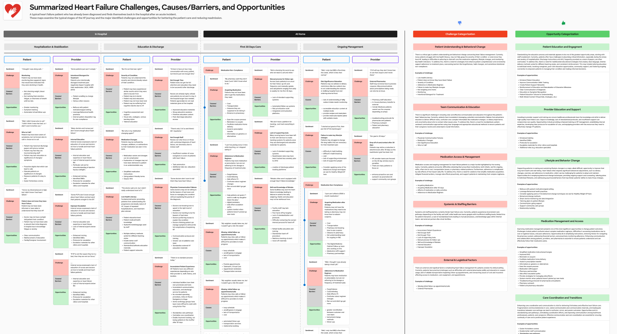
Anyone who has worked in healthcare knows how limiting an EHR can feel as you're trying to coordinate many actors in different systems, all to ensure the patient is receiving the most holistic, well informed care that can be given. Navigating these limitations, devising alternative solutions, and treading the line between what we can do and what we should do were key to my role.
The product design team built on that foundation after I completed the service design groundwork. This is an important distinction worth naming: service design work that enables a product to be built well is not the same as product design work. I defined the service. Other people designed the app. Both jobs had to be done, and they had to be done in order.
65+ caregiver research
The 65+ initiative started from a reasonable hypothesis: that the challenges facing older patients navigating complex healthcare are often inseparable from the challenges facing the people who care for them. This may be an elderly partner, struggling with their own health, or adult children who may end up managing a parent's appointments, medications, and care decisions. They may be part of the "sandwich generation", caring for both aging parents and their own young children. And more so, this is from a distance, often without clear visibility into what's happening. They are a critical and underserved part of the care system.
The work led to a specific and defensible proposal: proxy accounts within the MyBSWHealth platform that would give designated caregivers structured access to a patient's care information, with appropriate privacy controls and consent mechanisms. The concept had real support and excitement. It addressed a genuine gap. It made great use of a currently under-utilized feature. It was the right idea.
It got shelved due to resourcing and prioritization.
I don't think this outcome diminishes the research. The work established clearly what the problem was, who was affected by it, and what a solution would need to do. That foundation exists whenever BSWH decides it's ready to act on it, and the case for acting on it is well-documented. Healthcare organizations routinely revisit shelved work when the organizational conditions change. This is one I personally hope they revisit.
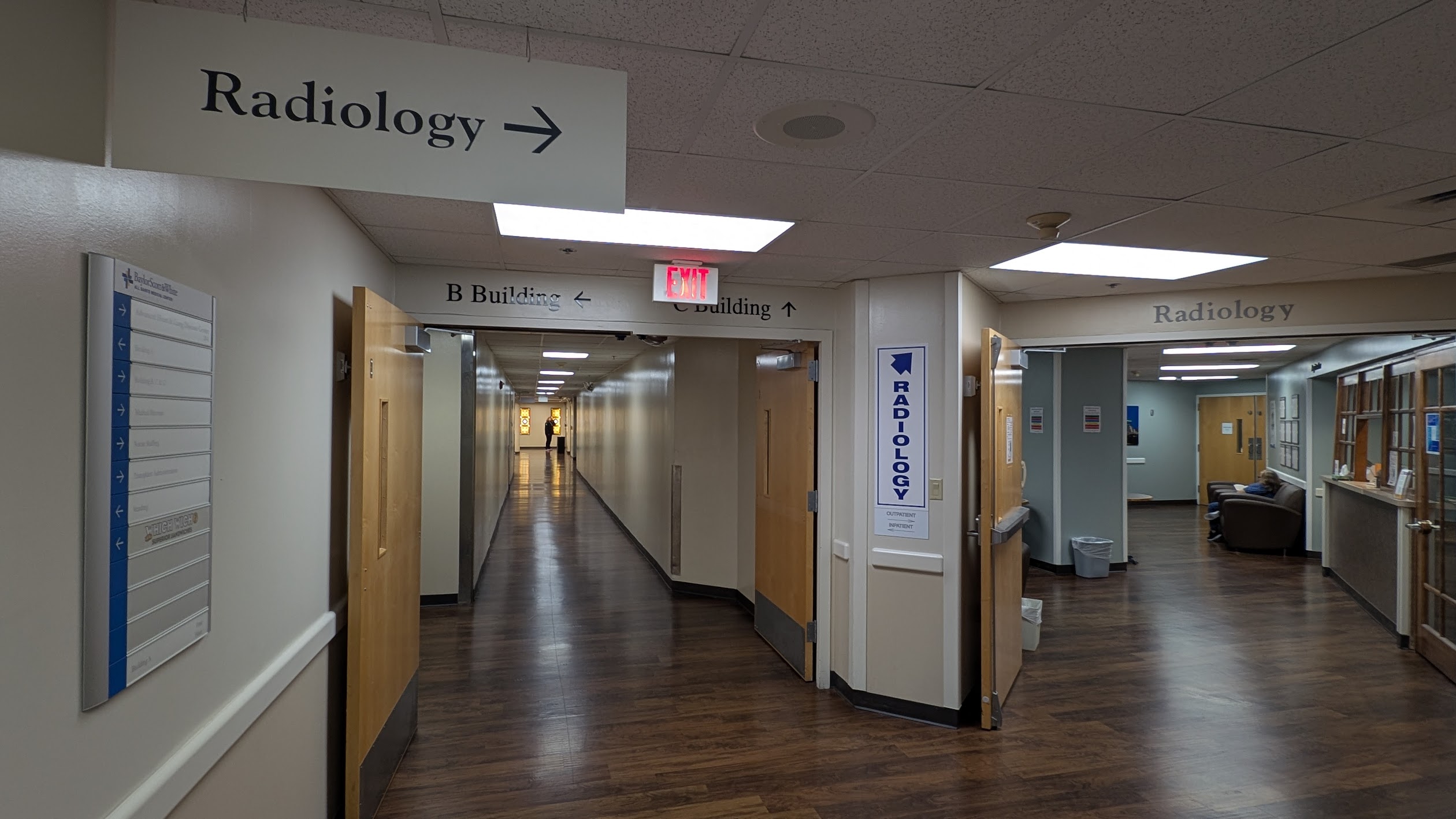
Hospital wayfinding
If you've ever been to a hospital, this one should resonate with you.
Wayfinding is a problem that healthcare organizations tend to underestimate until they start asking patients about it directly. Getting to a hospital appointment, finding the right building, the right entrance, the right elevator bank, the right department, is a navigational problem that frequently goes wrong. It causes missed appointments, generates anxiety, and erodes trust before a single clinical interaction has happened.
Hospitals are a complex space, complicated by physical architecture and time. Old timers might know a building by a different name, signs might have not been updated campus wide, elevators might be down for maintenance, and doctors frequently change offices.
The Check-in Journey team had identified this (along with most patients and visitors). Their initial instinct, understandably, was to look at in-app navigation improvements: videos, digital walk throughs. It was a reasonable starting point. It was also pointed at the wrong layer of the problem.
I spent several months doing the kind of research this problem required: site visits to multiple BSWH hospital campuses across the DFW area and as far out as Waco, walking the approaches patients walk, trying to find parking (and trying out the valet, for research), interviewing building access teams who understood the physical navigation challenges intimately, and talking to providers about where patients consistently got lost and what the downstream effects were. What we found was that the problem wasn't primarily a UX problem. It was a data problem, a physical space problem, and a communication problem — in that order.
The short-term digital intervention came out of a specific finding: the addresses surfacing in patient communications and appointment confirmations were often wrong. Not wrong because of a UX failure, it was wrong because Epic, the underlying system of record, stores billing addresses rather than building addresses, and those are frequently different. A patient directed to the billing address of a massive hospital campus can end up at the wrong building, the wrong entrance, or lost in a parking structure nowhere near their appointment.
The recommendation: parse the Epic data, match doctors to buildings, correct the addresses systematically, and surface the right information across the channels patients are already using like app notifications, text messages, appointment reminders. A relatively contained technical fix with a significant experiential impact.
The longer-term recommendation was a structured exploration of low-frequency Bluetooth beacon technology for on-site navigation (blue dot navigation) indoor positioning that would let a patient's phone guide them from the parking garage to the right floor of the right building. We vetted multiple vendors, mapped the cost and effort profile, and evaluated the realistic implementation timeline for a system the size of BSWH's campus footprint. The recommendation wasn't to build it now. It was to understand what it would actually take, so that when the organization decides to invest, they're doing it with clear eyes. Pilot locations needed to be identified, scale and scope of the mapping explored, but we had the info so that we could move confidently.
The value of this work isn't a product launch. It's a team that went into it aimed at one solution and came out understanding their problem more clearly than when they started. That's what good service design is supposed to do.
This chapter doesn't have a clean ending. The heart failure product has just launched its pilot. The 65+ work is waiting for the right moment. The wayfinding recommendations are in progress, with a focus on the identified low hanging fruit problems. That's the nature of discovery work at scale: you define the problem, you open up the solution space, you hand it off. The work here is less visible than the Specialty Care chapter. Fewer screens, no patient testimonials, no launch event. But it shaped what comes next for these teams, and that's the part of service design that's easiest to overlook and hardest to replace.